> For the complete documentation index, see [llms.txt](https://docs.gocipher.gg/llms.txt). Markdown versions of documentation pages are available by appending `.md` to page URLs; this page is available as [Markdown](https://docs.gocipher.gg/cipher-guides/guide-or-game-visual-styling.md).
# Guide | Game Visual Styling
**Your game's visual style is what makes someone stop scrolling and click Play.**
This guide covers the most popular art directions in 2D games, with real games you can look up for inspiration and prompts!
{% hint style="info" %} Not done with your game creation yet? We recommend you to check out: \
\
[**1. Getting Started**](/cipher-tutorials/1.-getting-started.md) to learn more about the tools you'll be mastering;\
[**2. Creating Your First Game**](/cipher-tutorials/2.-creating-your-first-game.md) to get your first game up and running; \
[**3A. Improve Your Game Via Design Studio**](/cipher-tutorials/3a.-improve-your-game-via-design-studio.md) to perfect your game manually;
[**3B. Improve Your Game Via Cyra**](/cipher-tutorials/3b.-improve-your-game-via-cyra.md) to perfect your game through chat
[**5. Publishing and Sharing Your Game**](/cipher-tutorials/5.-publishing-and-sharing-your-game.md) where you'll be launching it to gamers around the world!
{% endhint %}
***
### How to Use This Guide
[**Cipher**](https://main.gocipher.gg/create/games) can create your game in the art style you describe. You can even reference a specific game, describe a mood, or mix elements from completely different styles!
Browse the styles below and find the vibe that fits what you're making. Click to expand on each and learn more about the strategy behind it, plus an example prompt that you can try in your game!
***
### 1. Retro 8-Bit
Bold outlines, tight color palettes (3-4 colors per sprite), and chunky characters that read clearly even at small sizes. This style works well for platformers, action games, and adventure games where you want that classic, nostalgic game feel without it looking outdated.
*\*Click on each game to expand and learn more*
SHOVEL KNIGHT

**Shovel Knight nails the retro look by being super disciplined with color. Look up any screenshot and count the colors. There aren't many... but every single one pops!**
* Each level runs on just 3-4 dominant colors, keeping everything clean and readable.
* Every character is designed to be recognizable by silhouette alone
* If your game has a lot of different enemies or characters, this approach keeps things clear without needing tons of detail
{% hint style="info" %}
**Prompt Example:** *"Retro 8-bit style like Shovel Knight. Bold outlines, chunky sprites, bright colors on a limited palette. Characters should be instantly recognizable by shape."*
{% endhint %}
CAVE STORY

**Cave Story makes a variety of areas feel completely different, using the same simple art style and clever use of color.**
* Each zone has its own color temperature: \
Cool blues underground; Warm oranges in the desert; Soft greens in the gardens
* Moving between areas feels like entering a new world, even though the sprite style stays consistent
* If your game has multiple zones or levels, using color shifts like this can make each one feel fresh without redesigning everything
{% hint style="info" %}
**Prompt Example:** *"Classic indie retro style like Cave Story. Simple, charming sprites with clean outlines. Warm color identity that changes between areas."*
{% endhint %}
***
### 2. 16-Bit RPG
Richer colors, bigger sprites, and environments with way more detail than 8-bit allows. Characters have expressive animations and each location has its own visual identity. This is the go-to style for RPGs, adventure games, and story-driven games where you want the world to feel crafted and full of personality.
*\*Click on each game to expand and learn more*
CHRONO TRIGGER

**Chrono Trigger makes its characters feel alive at tiny sprite sizes.**
* Every party member has unique idle animations, victory poses, and movement quirks that show personality without a single word of dialogue
* Colors carry the story: \
Prehistoric areas are earthy and warm; the dark future is cold grays and blues; the medieval period is rich and green
* Build your game with Cipher using the same approach: \
Start by giving each character their own idle animation and movement style. When that's done, [**ask Cipher**](https://main.gocipher.gg/create/games) to assign a specific color palette to each area, so the world feels different as the player moves through it!
{% hint style="info" %}
**Prompt Example:** *"Expressive 16-bit RPG style like Chrono Trigger. Detailed character sprites with personality in their animations. Distinct color palette per area or environment."*
{% endhint %}
SEA OF STARS

**If you want that classic RPG vibe but don't want your game to look like it's from 1995, meet - Sea of Stars, that takes the classic 16-bit RPG look and adds lighting tricks that the SNES (Super Nintendo Entertainment System) couldn't dream of.**
* Shadows actually move with the time of day, water reflects the sky, and light sources in dungeons cast real illumination across the sprites!
* It feels nostalgic and modern at the same time, which is really hard to pull off. The trick is layering modern lighting on top of classic sprite art.
* [**Ask Cipher**](https://main.gocipher.gg/create/games) for dynamic shadows, time-of-day color shifts, and light sources that actually illuminate nearby sprites. That's what makes it feel current while keeping the retro character style!
{% hint style="info" %}
**Prompt Example:** *"Modern 16-bit RPG style like Sea of Stars. Handcrafted sprites with dynamic lighting and day-night shifts. Vibrant colors, lush environments. Classic JRPG feel with modern polish."*
{% endhint %}
***
### 3. HD-2D
2D character sprites placed inside a 3D world with real depth of field, camera blur, and volumetric lighting. The characters look retro but the world around them looks modern. This style works for RPGs and adventure games where you want that classic sprite-based look but with cinematic presentation.
*\*Click on each game to expand and learn more*
OCTOPATH TRAVELLER

**If you want something that looks retro AND cutting-edge at the same time, try HD-2D! Octopath Traveller created the "HD-2D" term. The whole idea is contrast: flat 2D characters living inside a world that has actual depth.**
* The camera has a shallow focus like a real camera lens, so backgrounds blur slightly behind the characters
* Light behaves realistically (through windows, bouncing off water) but the characters are traditional sprites
* The result feels like a handcrafted miniature world or a pop-up book come to life
* [**Ask Cipher**](https://main.gocipher.gg/create/games) to create 2D character sprites with a background that has depth, blur and realistic lighting. That combination of flat characters in a dimensional world is what creates the same HD-2D effect!
{% hint style="info" %}
**Prompt Example:** *"HD-2D diorama style like Octopath Traveler. Detailed 2D sprites in a layered world with depth of field and dramatic lighting. Retro characters in a modern visual framework."*
{% endhint %}
TRIANGLE STRATEGY
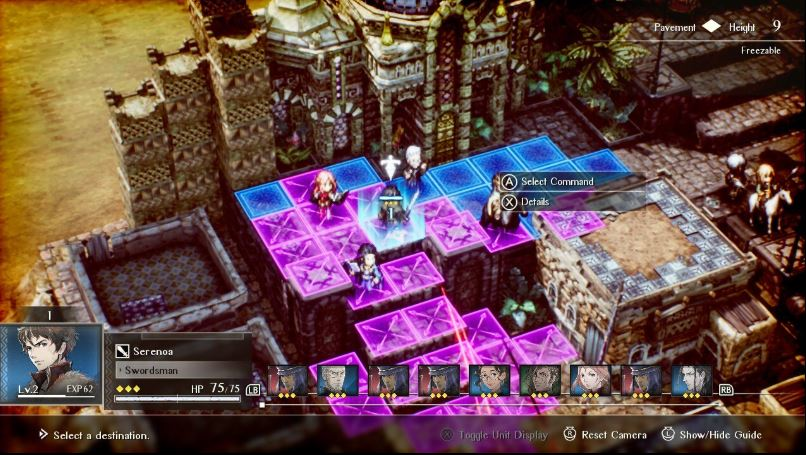
**Triangle Strategy takes the same HD-2D approach but with an overhead or isometric view - applying it to a tactical strategy game with battlefields, castles, and political drama.**
* The tilt-shift camera effect makes battle maps look like detailed tabletop miniatures
* Environmental effects like snow, rain, and fire interact with the lighting system, making weather feel real even with 2D sprites
* [**Ask Cipher**](https://main.gocipher.gg/create/games) for a tilt-shift camera effect, terrain with height variation, and weather that interacts with the lighting. That's what makes this style work for tactical games.
{% hint style="info" %}
**Prompt Example:** *"HD-2D tactical style like Triangle Strategy. Tilt-shift camera over detailed battle environments. 2D sprites on 3D terrain with dynamic weather and lighting effects."*
{% endhint %}
***
### 4. Dark and Gothic
Deep shadows, muted palettes dominated by purples, reds, and stone grays, and heavy architectural environments like castles, cathedrals, and dungeons. This style sets a mood immediately and works for combat games, horror, Metroidvanias, or anything where the world should feel oppressive or dangerous.
*\*Click on each game to expand and learn more*
CASTLEVANIA: SYMPHONY OF THE NIGHT

**Every room in this game is composed like a painting!**
* Foreground elements (pillars, railings, statues) frame the action and create depth
* The palette stays in a tight gothic range: purples, deep reds, stone grays, gold accents
* That color discipline gives the whole castle a unified identity while still letting individual rooms feel different
* If you're building a game set in one large, [**tell Cipher**](https://main.gocipher.gg/create/games) to keep the overall palette consistent (e.g. always purples and golds) but vary the specific tones and foreground details per area. That's how you make rooms feel different while still feeling like they belong to the same place
{% hint style="info" %}
**Prompt Example:** *"Gothic castle style like Castlevania: Symphony of the Night. Ornate interiors, chandeliers, stained glass. Deep purples, reds, and golds. Grand and imposing."*
{% endhint %}
BLASPHEMOUS

**Blasphemous picks one visual reference (Spanish religious art) and builds the entire game around it.**
* The palette is extremely restrained: earthy browns, deep reds, touches of gold
* Every piece of architecture, every enemy, every background pulls from the same visual source
* That level of consistency creates an atmosphere so thick you can feel it in every room
* If your game has a strong theme (horror, mythology, a specific culture), going all-in on one visual identity like this makes the world unforgettable
{% hint style="info" %}
**Prompt Example:** *"Dark religious art style like Blasphemous. Intricate sprite detail, gothic architecture, muted earth tones with red and gold accents. Heavy, oppressive atmosphere."*
{% endhint %}
***
### 5. Neon and High-Contrast
Saturated neon colors (pinks, cyans, purples) against very dark backgrounds. High contrast between lit and unlit areas. Glowing effects on attacks, pickups, and interactive elements. This style works for fast-paced action, cyberpunk, sci-fi, or anything that should feel electric and high-energy.
*\*Click on each game to expand and learn more*
HYPER LIGHT DRIFTER

**Hyper Light Drifter tells its entire story through strong visuals and art direction alone, without any text in the game.**
* Deep, dark backgrounds with vivid neon pinks, cyans, and purples layered on top
* The world mixes ancient ruins with alien technology, creating environments that feel mysterious and foreign
* Color is used to guide the player: interactive elements and dangers glow brighter than the environment around them
* If your game needs to communicate through visuals rather than words, or you want that neon-on-dark contrast, this is the top reference
{% hint style="info" %}
**Prompt Example:** *"Neon-saturated style like Hyper Light Drifter. Deep darks with vivid pink, cyan, and purple accents. Geometric, mysterious environments. Glowing elements to guide the player's eye."*
{% endhint %}
KATANA ZERO

**Katana ZERO looks like an action movie shot at night in a neon-lit city. Every frame is high-contrast and cinematic.**
* Bright neon light sources (signs, lamps, screens) bounce color off wet surfaces and dark walls
* The contrast between pitch-black shadows and intense neon creates a dramatic, stylish look
* Action effects (slashes, dashes, impacts) use bright color bursts against the dark backgrounds so every move reads clearly
* If your game is set in a city or has a noir tone, [**tell Cipher**](https://main.gocipher.gg/create/games) to add neon light sources that cast colored reflections on nearby surfaces, and use bright slash or dash effects against the dark backgrounds so every action pops on screen
{% hint style="info" %}
**Prompt Example:** *"Neon-noir style like Katana ZERO. High contrast with deep blacks and bright neon reflections. City environments with dramatic lighting. Bright color bursts on attacks against dark backgrounds."*
{% endhint %}
***
### 6. Warm and Cozy
Earthy color palettes built around greens, browns, soft yellows, and warm lighting. Environments packed with small, comforting details like plants, furniture, and food. Character designs that look approachable and friendly. This style works for farming games, life sims, town builders, puzzle games, and anything where you want the player to feel relaxed.
*\*Click on each game to expand and learn more*
STARDEW VALLEY

**The genius move here is seasonal color rotation. Same farm, same town, same characters, completely different palette four times a year!**
* Spring is bright greens and yellows. Summer is deep greens and warm golds. Fall is oranges and reds. Winter is cool whites and grays
* This keeps the world feeling fresh over dozens of hours without needing new locations
* The tiny details also matter: individual flowers, crops at different growth stages, furniture visible through windows
* If your game has locations where players spend a lot of time, seasonal or time-based color shifts like this keep things from going stale
{% hint style="info" %}
**Prompt Example:** *"Warm, cozy style like Stardew Valley. Earthy palette with greens, browns, and soft yellows. Detailed environments with small touches like individual plants and furniture. Seasonal color variation."*
{% endhint %}
MAPLESTORY

**MapleStory built an entire social world out of cute, anime-inspired sprite art that millions of players wanted to hang out in.**
* Characters are small, round, and friendly looking with big heads and expressive eyes
* Visible equipment and accessories on characters mean every player looks different, which creates a sense of personal identity
* Town environments use warm, bright colors with lots of animated background elements (NPCs walking, signs flickering, clouds moving)
* If your game has any customization elements, MapleStory's approach to making characters feel personal and towns feel alive is the reference
{% hint style="info" %}
**Prompt Example:** *"Cute, colorful style like MapleStory. Anime-inspired character sprites with visible customization. Bright, friendly town environments with animated background details."*
{% endhint %}
***
### 7. Cartoon and Exaggerated
Extreme squash-and-stretch animation, exaggerated facial expressions, and character proportions that change shape mid-action. Inspired by 90s cartoons and comic strips. This style works for comedic games, party games, fast-paced platformers, and anything that should feel high-energy and fun to watch.
*\*Click on each game to expand and learn more*
PIZZA TOWER

**Nothing in this game is ever at rest. That's the whole visual philosophy!**
* Characters stretch when they run, squash when they land, and contort into wild shapes during attacks
* Faces cycle through extreme expressions frame by frame
* The style pulls from SpongeBob and 90s cartoons, so it feels hand-drawn and slightly unhinged
* If your game is going for comedy or high energy, this level of character animation is what makes every action feel entertaining to watch, even basic movement
{% hint style="info" %}
**Prompt Example:** *"Manic cartoon style like Pizza Tower. Exaggerated squash and stretch on characters. Wild, hand-drawn energy. Expressive faces, chaotic movement, nothing sits still."*
{% endhint %}
CUPHEAD

**Cuphead recreates the look of 1930s hand-drawn cartoons. Every frame looks like it was pulled from an old Disney or Fleischer Brothers short.**
* Characters have rubber hose limbs (bendy, no joints) with exaggerated squash and stretch
* Backgrounds are painted in watercolor, giving them a soft, textured quality that contrasts with the crisp character outlines
* The whole game has a vintage film grain and slight color desaturation that sells the old-timey look
* If your game has a specific visual era it's trying to channel (not just "retro" but a particular decade or animation style), Cuphead is an example of how committing fully to that reference makes the game unforgettable
{% hint style="info" %}
**Prompt Example:** *"1930s cartoon style like Cuphead. Rubber hose character limbs, exaggerated animations, watercolor-painted backgrounds. Vintage film grain and slight desaturation."*
{% endhint %}
***
### 8. Hand-Drawn Arcade
Large, detailed character sprites with high frame-count animations that make every action feel smooth and impactful. Backgrounds are just as detailed as the characters, with moving elements and environmental storytelling in every stage. This style works for fighting games, run-and-gun shooters, beat-em-ups, and action games where combat needs to feel weighty and satisfying.
*\*Click on each game to expand and learn more*
STREET FIGHTER II

**Every character in Street Fighter II is a masterclass in visual identity. Ryu, Chun-Li, Blanka, Dhalsim. Each one is instantly recognizable, culturally distinct, and animated with dozens of unique frames for every attack, hit reaction, and victory pose.**
* The backgrounds are just as detailed as the characters, with animated spectators, moving vehicles, and environmental storytelling in every stage
* Large sprites with smooth animation make every punch and kick feel like it has real weight behind it
* If your game has combat, [**ask Cipher**](https://main.gocipher.gg/create/games) for larger character sprites with distinct hit animations, impact effects on contact, and recovery frames after attacks. That combination of size, animation, and feedback is what makes combat feel physical
{% hint style="info" %}
**Prompt Example:** *"Detailed arcade fighting style like Street Fighter II. Large character sprites with fluid combat animations. Each character visually distinct. Lively backgrounds with environmental details and movement."*
{% endhint %}
METAL SLUG

**Metal Slug is famous for its animation density. Every sprite has way more frames than it technically needs, and that's exactly why it plays incredibly.**
* Soldiers stumble when hit. Vehicles crumble piece by piece. Characters yawn and stretch during idle moments
* Those extra details are what separate good art from art that makes people stop and stare
* If you want your game to feel premium and polished, adding extra animation on key characters and actions (even small ones the player might not consciously notice) is what sells it!
{% hint style="info" %}
**Prompt Example:** *"Highly animated action style like Metal Slug. Detailed sprites with tons of animation frames. Explosive effects, character reactions on every action, dense visual detail."*
{% endhint %}
***
### 9. Minimalist
Focused on making every visual element count, very limited color palettes are used. (Sometimes just black and white) Simple character sprites are made from just a few pixels, with lots of empty space on screen. This style works for puzzle games, narrative-focused games, and concept-driven games where gameplay mechanics or story carry the experience.
*\*Click on each game to expand and learn more*
UNDERTALE

**Undertale's minimalistic style proves that personality doesn't always need detail. The sprites are basic, but every character feels alive.**
* The secret is in how characters move, idle, and react, not in how many pixels they're made of
* The real visual creativity shows up in the battle system, where attacks become inventive bullet-hell patterns inside a tiny play area
* If you're working with a simple art style, put your creative energy into movement, animation quirks, and how your game's systems look in action rather than making sprites more complex!
{% hint style="info" %}
**Prompt Example:** *"Simple, expressive style like Undertale. Dark backgrounds, basic but characterful sprites. Personality through small details and animation, not complexity. Minimalist but full of charm."*
{% endhint %}
VAMPIRE SURVIVORS

**Vampire Survivors uses extremely basic sprites (tiny characters, simple enemy shapes) but creates visual spectacle through sheer quantity.**
* Individual sprites are small and simple. The visual impact comes from having hundreds of them on screen at once
* Attacks, pickups, and level-up effects use bright colors and screen-filling animations that contrast with the simple base sprites
* If your game involves large numbers of objects or enemies, you can choose to keep each one visually simple so the chaos is readable and not overwhelming
{% hint style="info" %}
**Prompt Example:** *"Simple retro sprites like Vampire Survivors. Basic character and enemy designs. Visual impact through large numbers of sprites on screen and bright, screen-filling attack effects."*
{% endhint %}
***
### 10. High-Detail Modern
Dense, layered environments where background details tell a story (specific objects on shelves, food on tables, posters on walls). Modern lighting effects like soft shadows and warm glows applied to 2D sprites. This style works for RPGs, adventure games, and any game with explorable locations where you want players to slow down and look around.
*\*Click on each game to expand and learn more*
EASTWARD

**Eastward's visual power comes from environmental storytelling. Every room is packed with objects that tell you about the people who live there.**
* A mechanic's shop has specific tools on specific shelves. A kitchen has half-eaten food on the counter
* Warm lighting and soft shadows make everything feel real and inviting
* Players who look closely are rewarded with details they'll notice on their second or third visit
* If your game has towns, safe rooms, or hubs where players spend time, filling them with specific, meaningful details is what turns "a room" into "a place"
{% hint style="info" %}
**Prompt Example:** *"Richly detailed modern style like Eastward. Dense, layered environments full of small details. Warm lighting with soft shadows. Characters with large expressive heads."*
{% endhint %}
DAVE THE DIVER

**Dave the Diver uses a smart design choice where they keep the characters simple and make the world around them detailed.**
* The player character is a chunky, simple sprite with limited animation
* The underwater environments are lush, colorful, and full of motion (swimming fish, waving plants, light filtering through water)
* That contrast actually improves gameplay because the simple character is easy to track against the busy backgrounds
* If your game has detailed environments, keeping the player visually simpler is a readability trick that works really well
{% hint style="info" %}
**Prompt Example:** *"Hybrid style like Dave the Diver. Chunky character sprites in detailed, colorful environments. Underwater scenes with animated sea life. Lighthearted, charming, and visually rich."*
{% endhint %}
***
### 11. Clean and Precise
Soft color palettes, smooth sprites, and backgrounds designed to support the gameplay rather than compete with it. Every element on screen is easy to read even during fast action. This style works for precision platformers, bullet-hell games, and any game where the player needs to track multiple things at once without visual clutter.
*\*Click on each game to expand and learn more*
CELESTE

**Celeste ties its color palette to the emotional arc of the story, and that's what makes it special.**
* Early mountain chapters use cool blues and whites that feel lonely and quiet
* As the story intensifies, the palette shifts to warm pinks and purples
* The player character stays visually consistent throughout, which keeps her readable against any background
* If your game has distinct levels or chapters, matching the color palette to the emotional tone of each section creates a visual journey the player feels even if they can't explain why!
{% hint style="info" %}
**Prompt Example:** *"Soft, expressive style like Celeste. Color palette that shifts between cool and warm tones across areas. Small but characterful sprites. Clean backgrounds that support gameplay, not fight it."*
{% endhint %}
TERRARIA

**Terraria builds an entire world out of simple, color-coded tiles, and it works because every biome is instantly recognizable by its palette.**
* Forest is green, desert is gold, corruption is purple, snow is white, hell is red. You always know where you are just by the colors on screen
* Individual blocks and sprites are simple, but they combine into massive, varied landscapes that feel different every time
* If your game has a large world with different zones, using a strong, distinct color identity per area (like Terraria does) keeps navigation intuitive without needing a map
{% hint style="info" %}
**Prompt Example:** *"Colorful sandbox style like Terraria. Distinct color identity per biome or zone. Simple individual tiles that combine into rich, varied landscapes. Wide visual range across different areas."*
{% endhint %}
***
### 12. Sci-Fi and Alien
Dim, restricted color palettes with cold tones (blues, greens, grays). Environments that mix organic textures with unfamiliar technology. Tight, claustrophobic spaces that create tension through visual design alone. This style works for exploration games, horror, sci-fi shooters, and anything set in a world that should feel hostile and unknown.
*\*Click on each game to expand and learn more*
METROID

**The original 1986 Metroid used the NES's (Nintendo Entertainment System) limited hardware to do something most games at the time didn't even try: create atmosphere.**
* While other NES games went bright and cheerful, Metroid chose dark, moody color palettes. Brinstar is deep blue-green, Norfair is harsh red-orange, Tourian is cold gray-purple
* The maze-like corridors are tight and disorienting on purpose. You're supposed to feel lost
* There's no hand-holding, no map, no friendly NPCs. The visual design tells you this world wasn't built for you
* If your game needs to feel isolating or hostile, Metroid is an example of using dark palettes, tight spaces, and zero visual comfort - the foundation that every atmospheric sci-fi game since has built on
{% hint style="info" %}
**Prompt Example:** *"Dark, atmospheric sci-fi style like Metroid. Dim, alien color palettes. Organic textures mixed with technology. Maze-like environments that feel claustrophobic and unknown."*
{% endhint %}
AXIOM VERGE

**Axiom Verge takes Metroid's alien atmosphere and pushes it into stranger, more unsettling territory.**
* Environments blend organic, fleshy textures with cold, angular technology. Nothing looks natural or safe
* The color palette mixes greens, purples, and flesh tones in combinations that feel deliberately wrong
* Glitch effects are baked into the art style itself - from corrupted tiles, visual distortion, and screen artifacts.
* If your game is set in an alien or corrupted world and you want the visuals themselves to feel "off," Axiom Verge is an example on how to use color and texture to make an environment feel fundamentally wrong
{% hint style="info" %}
**Prompt Example:** *"Alien, biomechanical style like Axiom Verge. Organic textures mixed with angular technology. Unsettling color combinations using greens, purples, and flesh tones. Glitch effects as a visual design choice."*
{% endhint %}
***
### 💡 Pro-Tip: Mixing Styles
You don't have to just pick one direction and stick to it - some of the most memorable games combine elements that shouldn't work together but do! Mixing styles is how you end up with something that doesn't look like anyone else's game.
> **Contrast is what makes combinations work.** \
> The trick is to pick one style for your environments and a different one for your characters (or one style for safe areas and another for dangerous ones). Or use one look for safe areas and another for dangerous zones.
**Example Prompts:**
* *"**Neon** color palette with **minimalist** sprites. Bright glowing characters on stark black backgrounds."*
* ***"Minimalist** character sprites like Undertale in **warm, detailed** environments like Stardew Valley."*
* *"**Dark gothic** backgrounds like Castlevania with **cartoon character** accents like Pizza Tower on attacks and pickups."*
{% hint style="info" %}
Simply describe what you want to [**Cipher**](https://gocipher.gg). \
Don't worry about experimenting, changing your mind midway, or mistakes! \

You can always restore your game to a previously saved version by clicking **History** in your project workspace.
{% endhint %}
---
# Agent Instructions
This documentation is published with GitBook. GitBook is the documentation platform designed so that both humans and AI agents can read, navigate, and reason over technical content effectively. Learn more at gitbook.com.
## Querying This Documentation
If you need additional information that is not directly available in this page, you can query the documentation by asking a question.
Perform an HTTP GET request on the following URL with the `ask` and `goal` query parameters:
```
GET https://docs.gocipher.gg/cipher-guides/guide-or-game-visual-styling.md?ask=&goal=
```
`ask` is the immediate question: it should be specific, self-contained, and written in natural language.
`goal` is what the user is ultimately trying to achieve, the reason they need the answer. Sharing it helps GitBook give you a better, more relevant answer. A goal is most helpful when it describes the outcome the user wants rather than restating the question. For example, with `ask=how do I create an API token`, a goal like `automate deployments from our CI pipeline` lets GitBook tailor the answer to that use case.
The response will contain a direct answer to the question and relevant excerpts and sources from the documentation.
Use this mechanism when the answer is not explicitly present in the current page, you need clarification or additional context, or you want to retrieve related documentation sections.